― CONCEPT STUDY ―
MacMall is an online retailer specializing in Apple products and accessories. Despite offering competitive pricing, the platform struggles with usability issues, outdated design, and a complex checkout process, leading to poor user engagement and conversion rates.
Adobe XD
Adobe Photoshop
MacMall is an authorized online reseller of Apple products. They buy Apple products in bulk, which allows them to sell them at a volume discount. MacMall is a wholly owned subsidiary of PCM, Inc.
The homepage suffers from a cluttered layout, inefficient navigation, and an outdated visual design, which negatively impacts user engagement and conversion rates. The lack of clear product categorization makes it difficult for users to find what they need quickly, while the absence of a strong visual hierarchy causes confusion and distraction. Additionally, weak call-to-action (CTA) placements fail to effectively guide users toward making a purchase. These issues contribute to a high bounce rate, low user trust, and a frustrating shopping experience that prevents MacMall from fully capitalizing on its competitive pricing and product offerings.
The goal of this redesign is to create a modern, user-friendly experience that enhances product discoverability, simplifies navigation, and builds trust with users. By adopting a clean, Apple-inspired aesthetic, improving the visibility of key promotions, and introducing a stronger information hierarchy, the new design aims to reduce friction in the user journey. Additionally, optimizing mobile responsiveness and refining CTA placements will encourage conversions and create a seamless shopping experience that aligns with customer expectations. Ultimately, the redesign seeks to increase engagement, lower bounce rates, and drive higher sales through an improved UX strategy.
Competitive Analysis
The redesign introduces a clean and modern UI by removing clutter and incorporating more whitespace, improving readability and creating an Apple-inspired minimalist design that aligns with user expectations. Navigation and product discovery have been enhanced with clearly defined categories at the top for quick access, along with a prominent and easily accessible search bar. To establish a stronger visual hierarchy, featured deals and new arrivals are now placed above the fold, ensuring high visibility, while high-contrast CTAs like “Shop Now” and “View Deals” guide users toward key actions. Lastly, to build trust and transparency, customer reviews and ratings have been integrated into the homepage, along with security badges and return policy information, reassuring users and increasing confidence in their purchases.
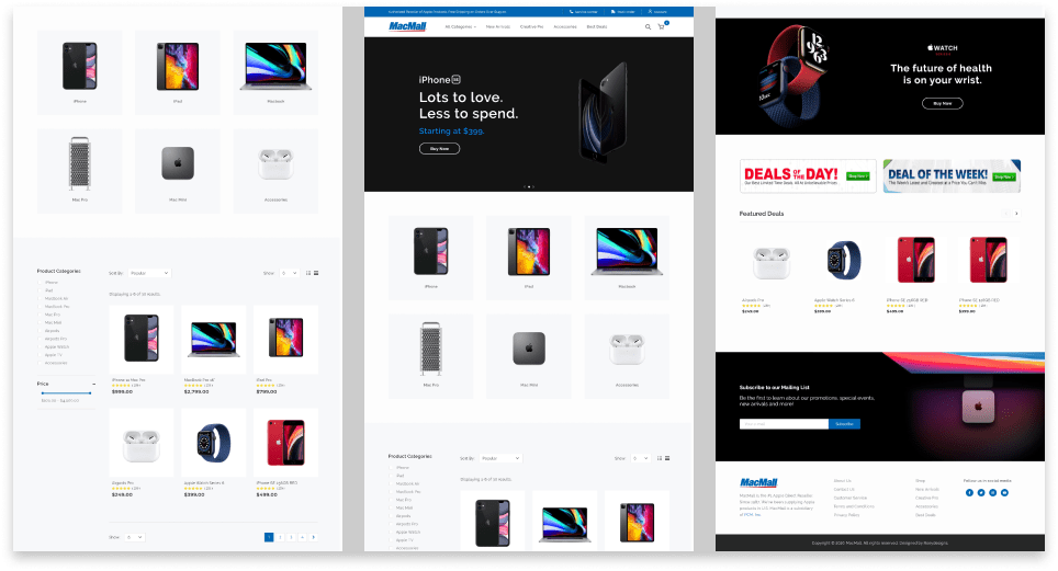
The MacMall redesign highlights the importance of visual clarity, intuitive navigation, and trust-building elements in e-commerce UX. A cluttered layout and weak information hierarchy can overwhelm users, making it harder for them to find products and complete purchases. Improving product categorization, CTA visibility, and trust signals can significantly enhance the shopping experience, reduce friction, and increase conversions.
Key takeaways from this project: Simplicity improves engagement – A clean, well-structured homepage helps users focus and navigate efficiently.
Navigation drives discoverability – Clear product categories and search optimization reduce frustration.
Trust signals matter – Customer reviews, security badges, and transparent policies build confidence in the brand.
© Roey Cunanan, 2025. All rights reserved.
Visit my old websites
Like what you saw? Let's work together