Secret Retreat is a curated collection of boutique hotels, villas, and unique travel experiences across Asia and Europe.
While the brand offers exceptional services, its website presents opportunities for enhancement in terms of user experience and visual design. This case study outlines the process of redesigning the Secret Retreat website to align with modern minimalist design principles, improving usability and aesthetic appeal.
Timeline
Oct 2024 – Nov 2024
My Role
UX/UI Designer
Tools
Figma
Problem Statement
Exploring and booking stays on Secret Retreat website feels outdated, and unintuitive. How can we create a modern experience that reflects the brand’s premium offering and helps users easily find and book their ideal vacation?
UX Audit
To uncover usability issues and assess the effectiveness of the current user experience, I conducted a heuristic evaluation of the Secret Retreats website using Jakob Nielsen’s 10 Usability Heuristics as a framework. This method allowed for a structured, expert-based review of the site’s interface, focusing on common patterns that impact usability, clarity, and efficiency.
01
Visibility of system status
Users lack feedback during key actions like booking or filtering, which can lead to uncertainty.
02
Match between system and real world
While the language is travel-centric, some copy lacks clarity or structure, especially around booking steps and amenities.
03
Consistency and standards
Navigation patterns are inconsistent between pages, and filters/search aren’t standardized across sections.
04
Recognition rather than recall
Users must remember details about properties or re-navigate to compare listings, there’s no visual shortlist or saved feature.
05
Aesthetic and minimalist design
The overall visual design feels cluttered on some pages and lacks alignment with modern luxury aesthetics.
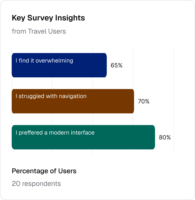
User Research
To gain deeper insights into user behavior and preferences, I conducted surveys with 20 users who regularly book accommodations online. The goal was to understand their expectations, pain points, and preferences when interacting with travel booking platforms.
65%
of respondents felt the current website is overwhelming, citing excessive text and cluttered visuals.
70%
reported difficulty navigating to specific destinations or properties, often getting lost in the site’s structure.
80%
expressed a strong preference for a cleaner, more modern interface, in line with other premium travel platforms.
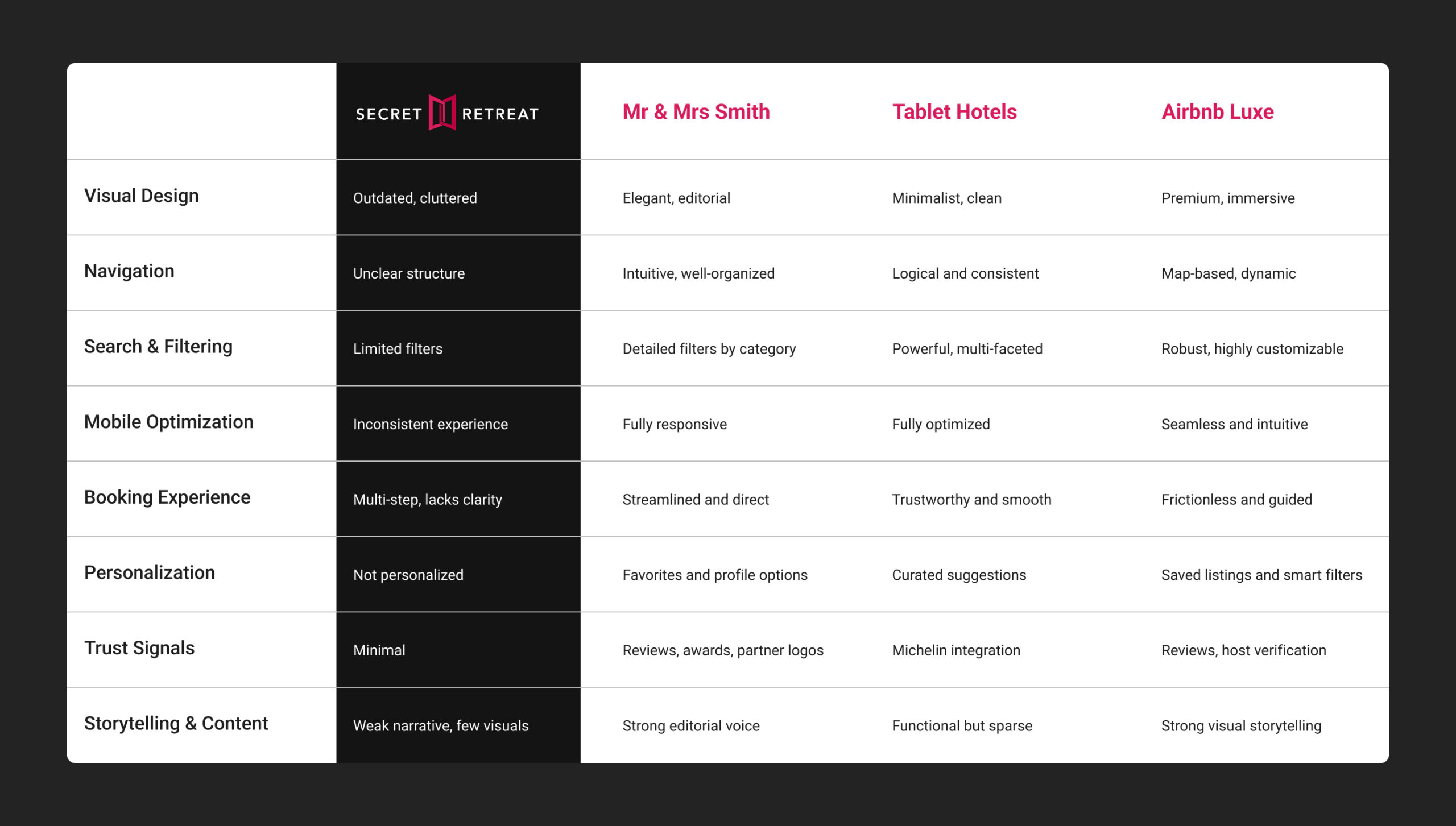
Competitive Analysis
To better understand industry standards and opportunities for differentiation, I analyzed the UX patterns of three competitors in the boutique and luxury travel space.
Prototype
The redesign focused on elevating usability, visual clarity, and brand storytelling. The following parts are the breakdown of each redesigned feature/page, highlighting key UX and UI improvements.
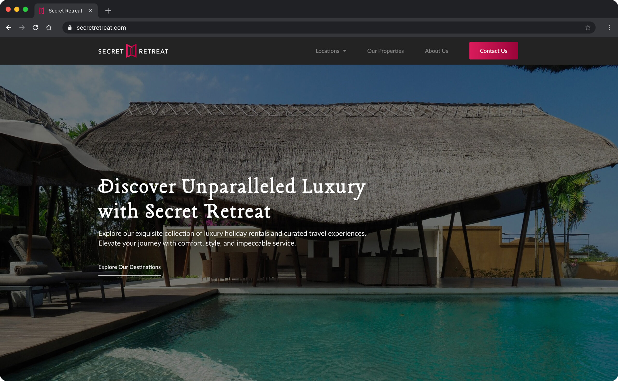
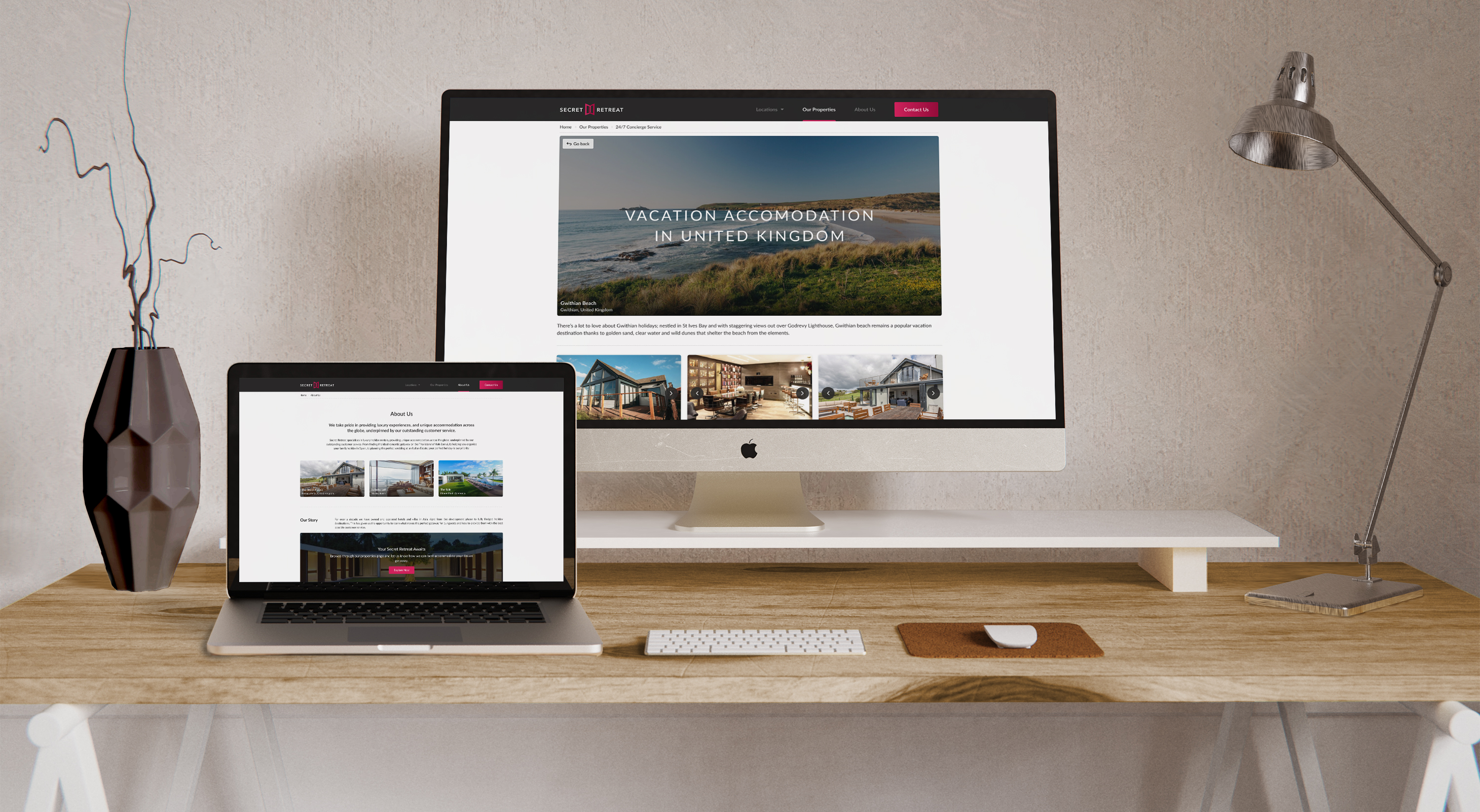
Homepage
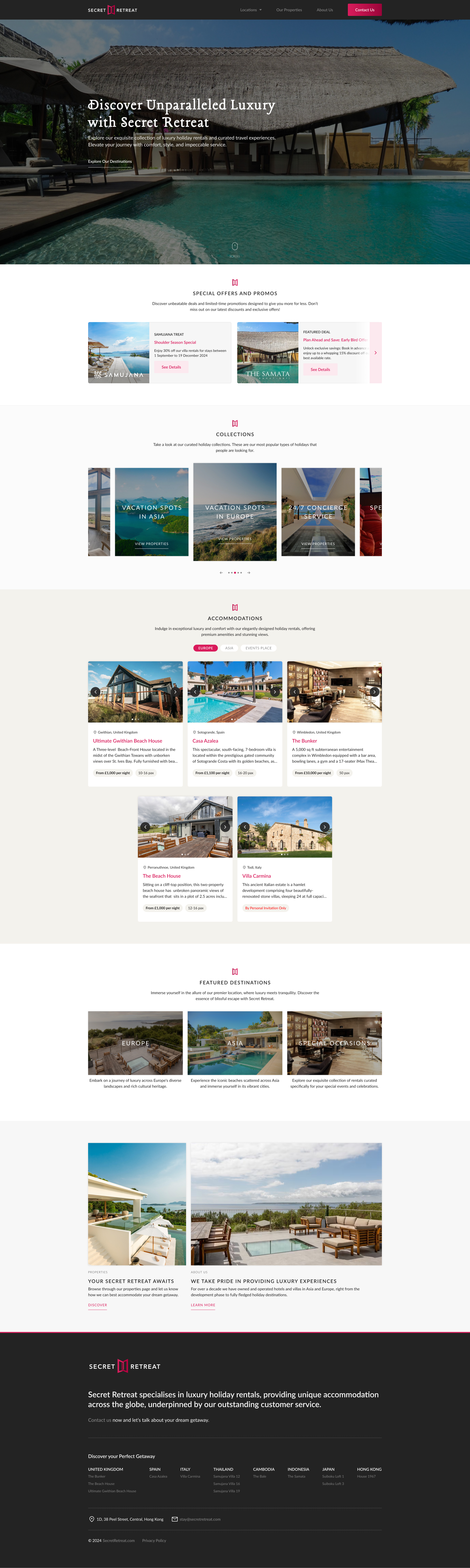
The homepage now features a clean layout with well-defined sections, replacing the previously fragmented content. The hero section clearly communicates the brand’s value and invites users to explore further. Visitors can navigate through promos, accommodations, and curated collections for a more personalized experience. Each section has been refined with a modern, visually appealing design to enhance clarity and user engagement.
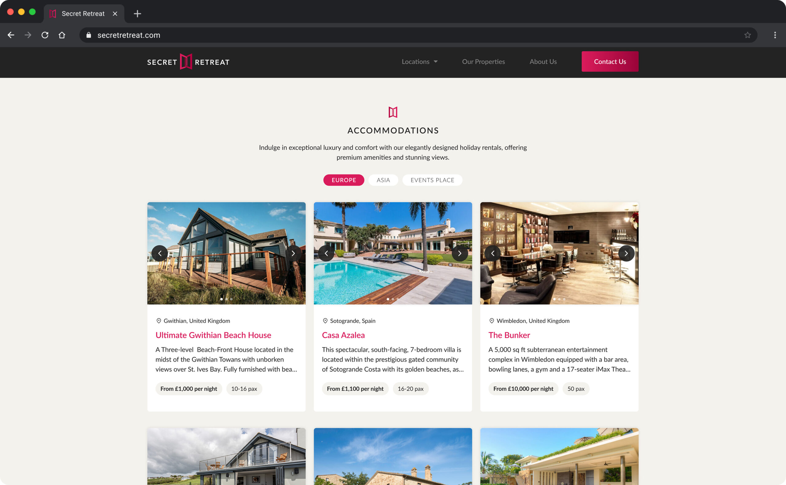
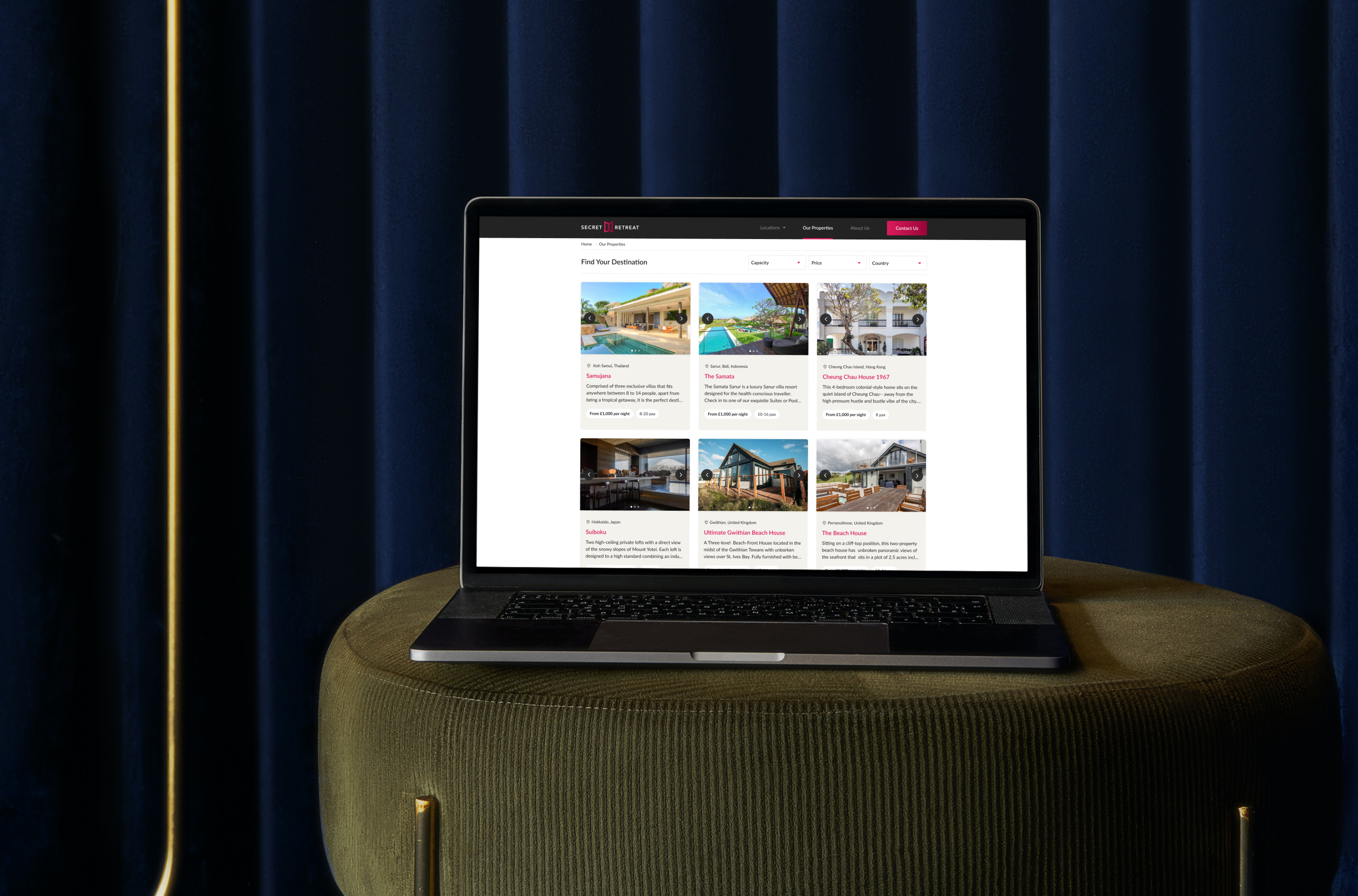
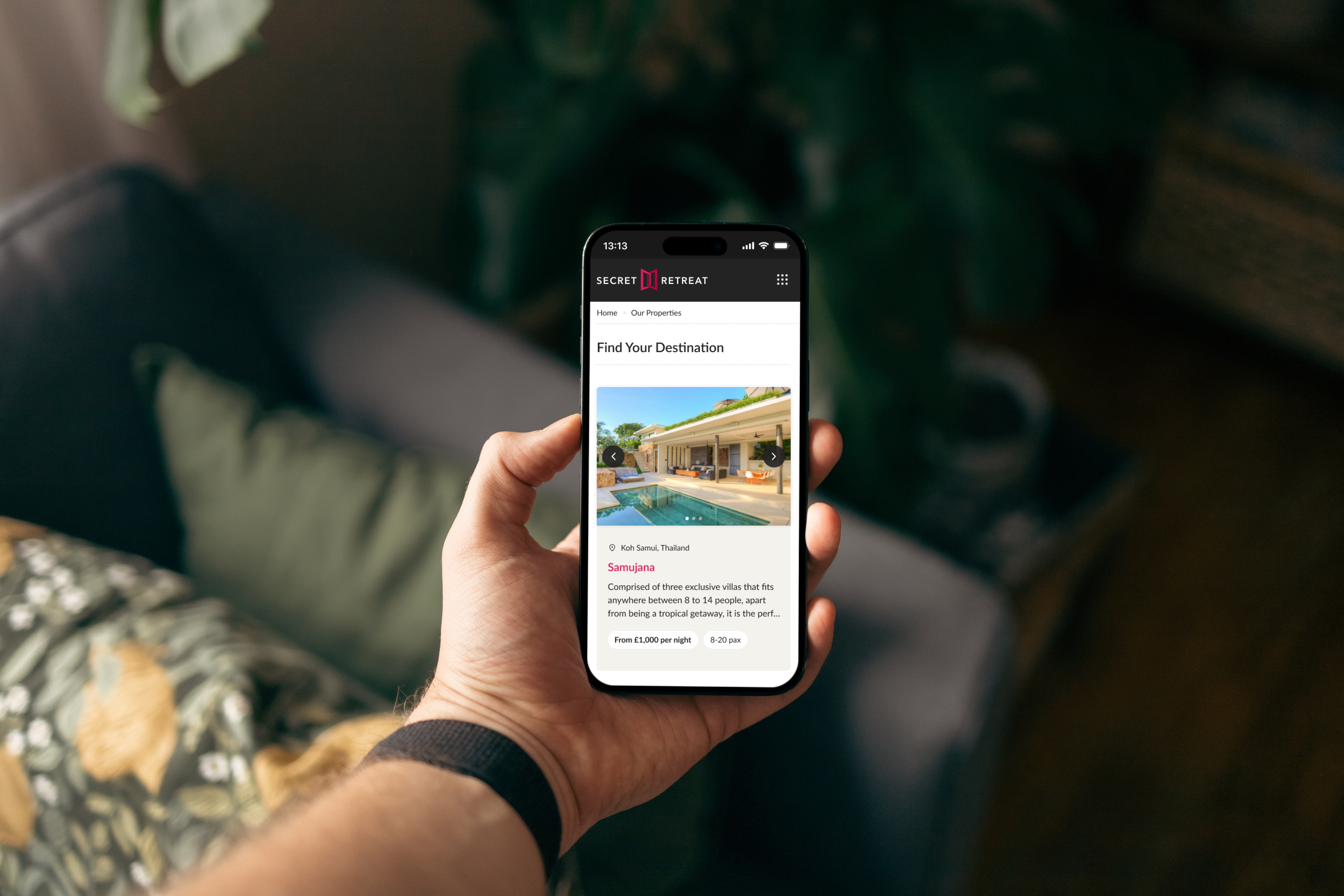
Properties
Listing Page
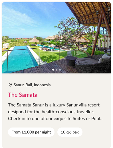
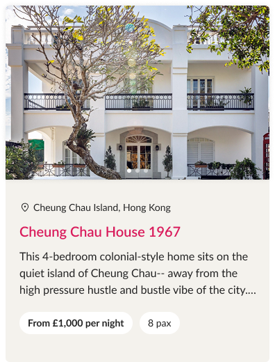
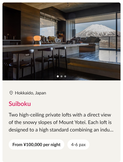
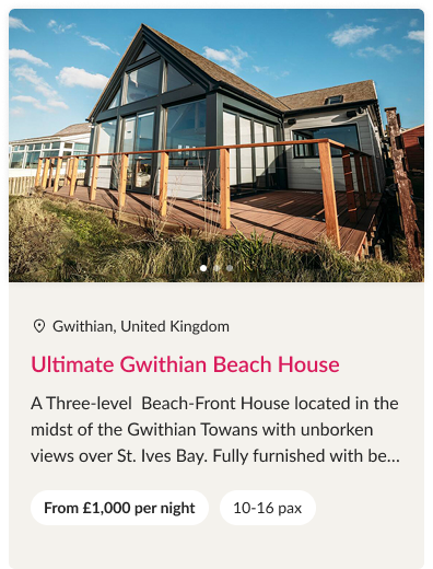
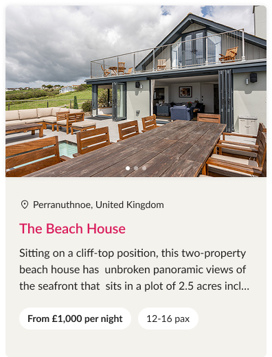
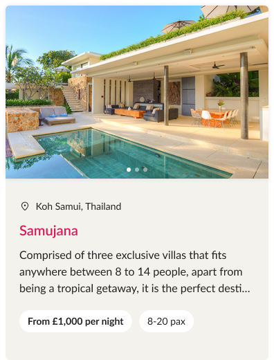
The previous listing page was hidden under the “Search” section and lacked a clear structure, with an unbalanced layout that prioritized less relevant information. Key details that users needed to make decisions were buried within individual property pages. In the redesign, we surfaced essential information making it easier for users to quickly compare and select their preferred stay.
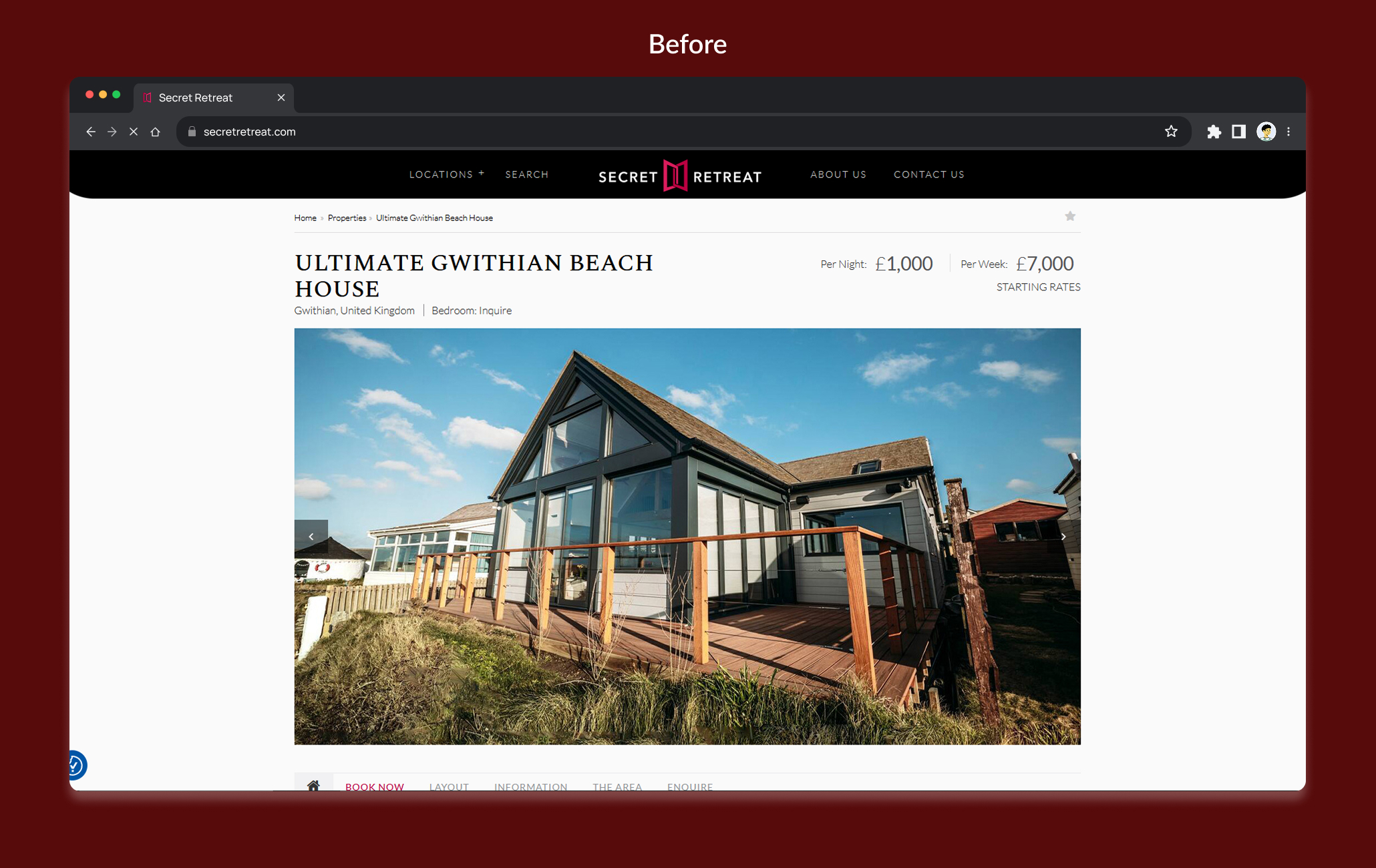
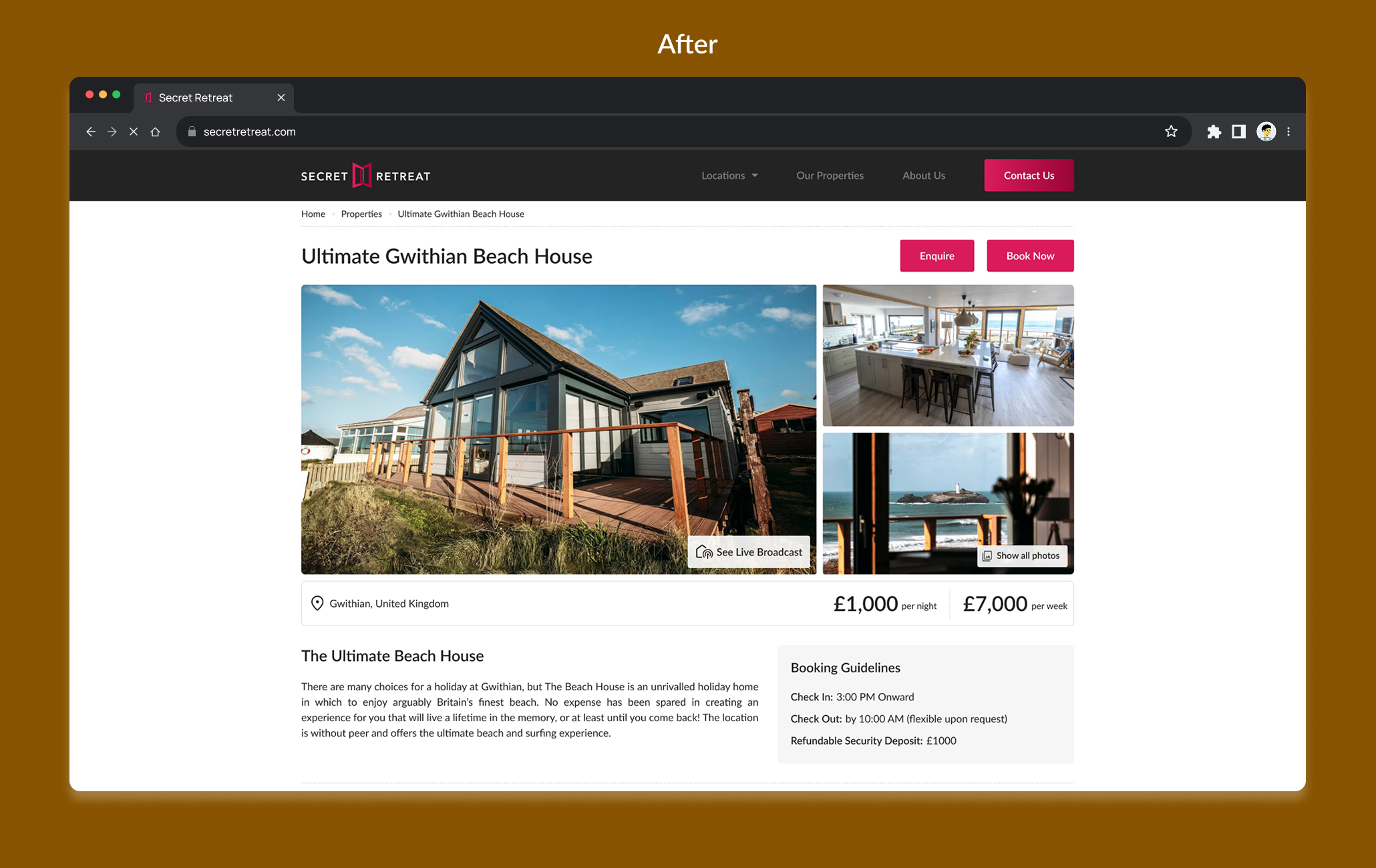
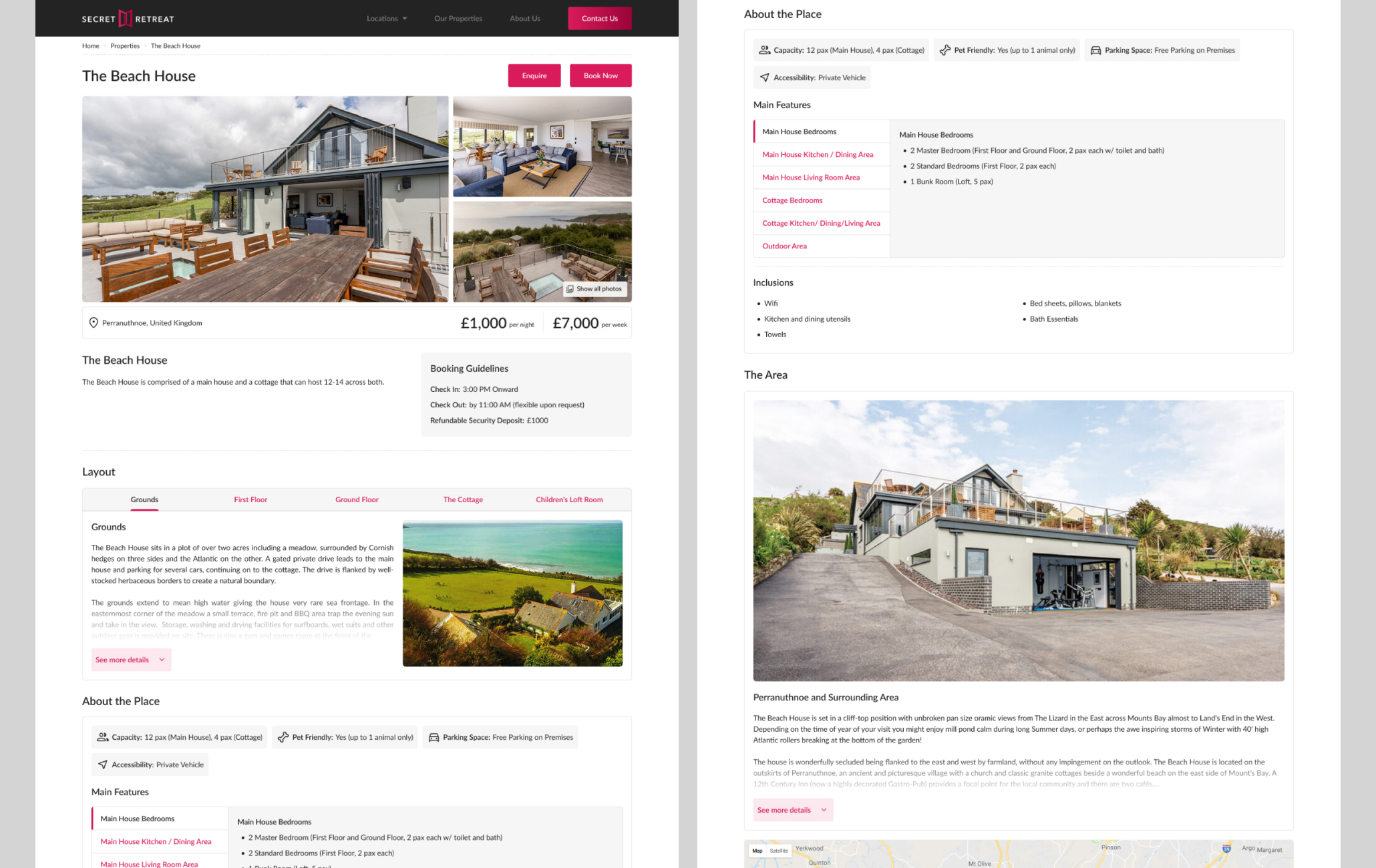
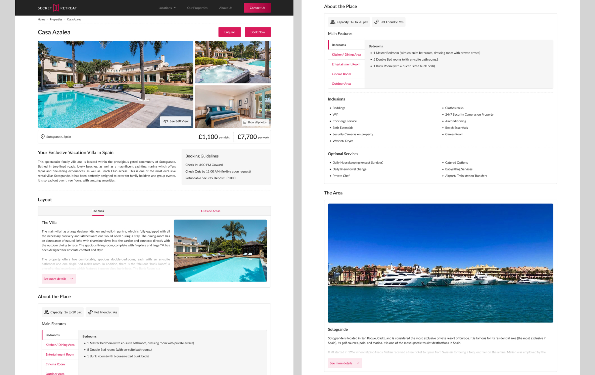
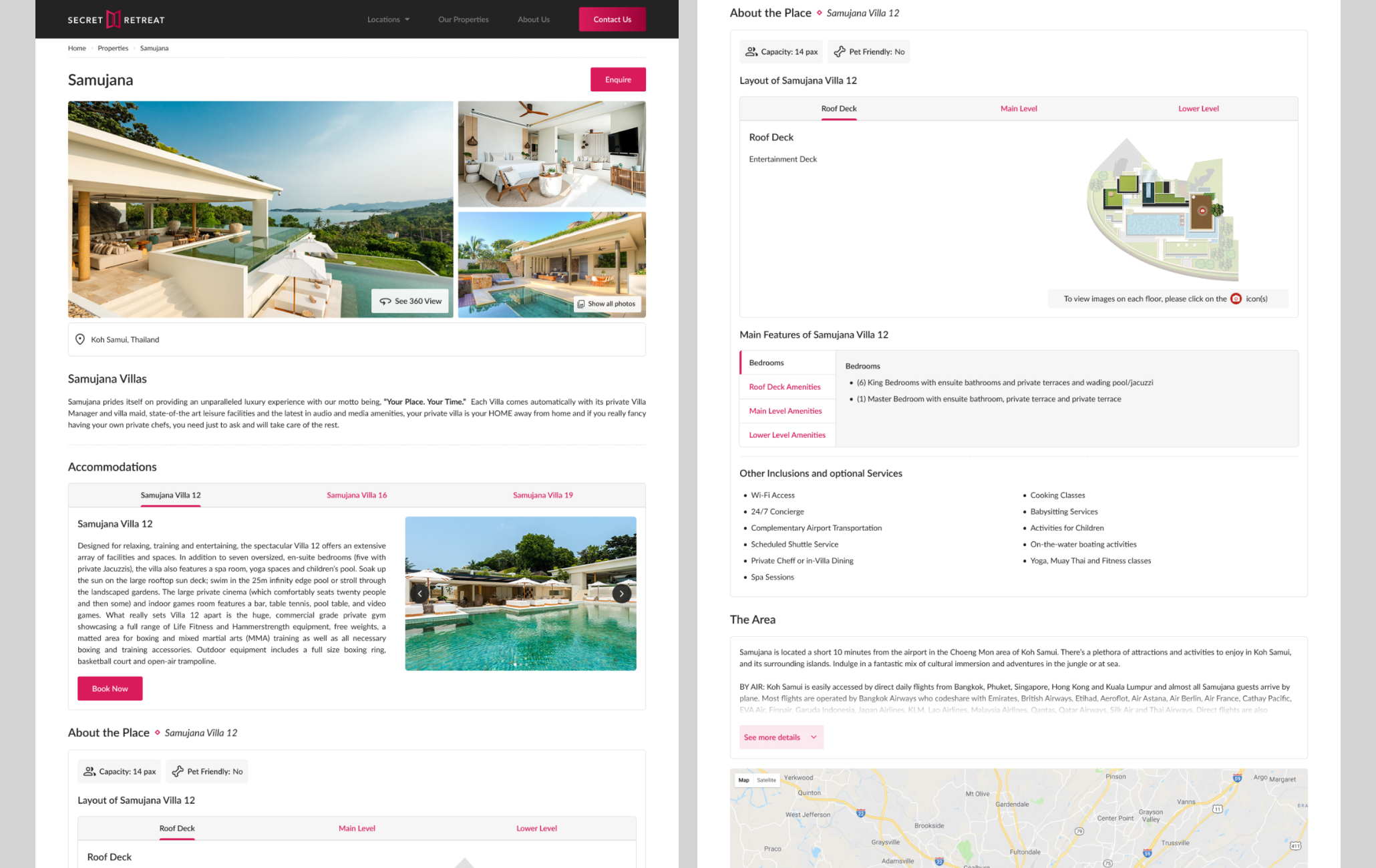
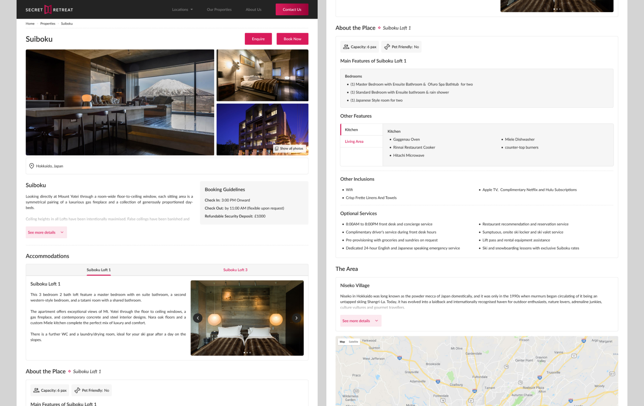
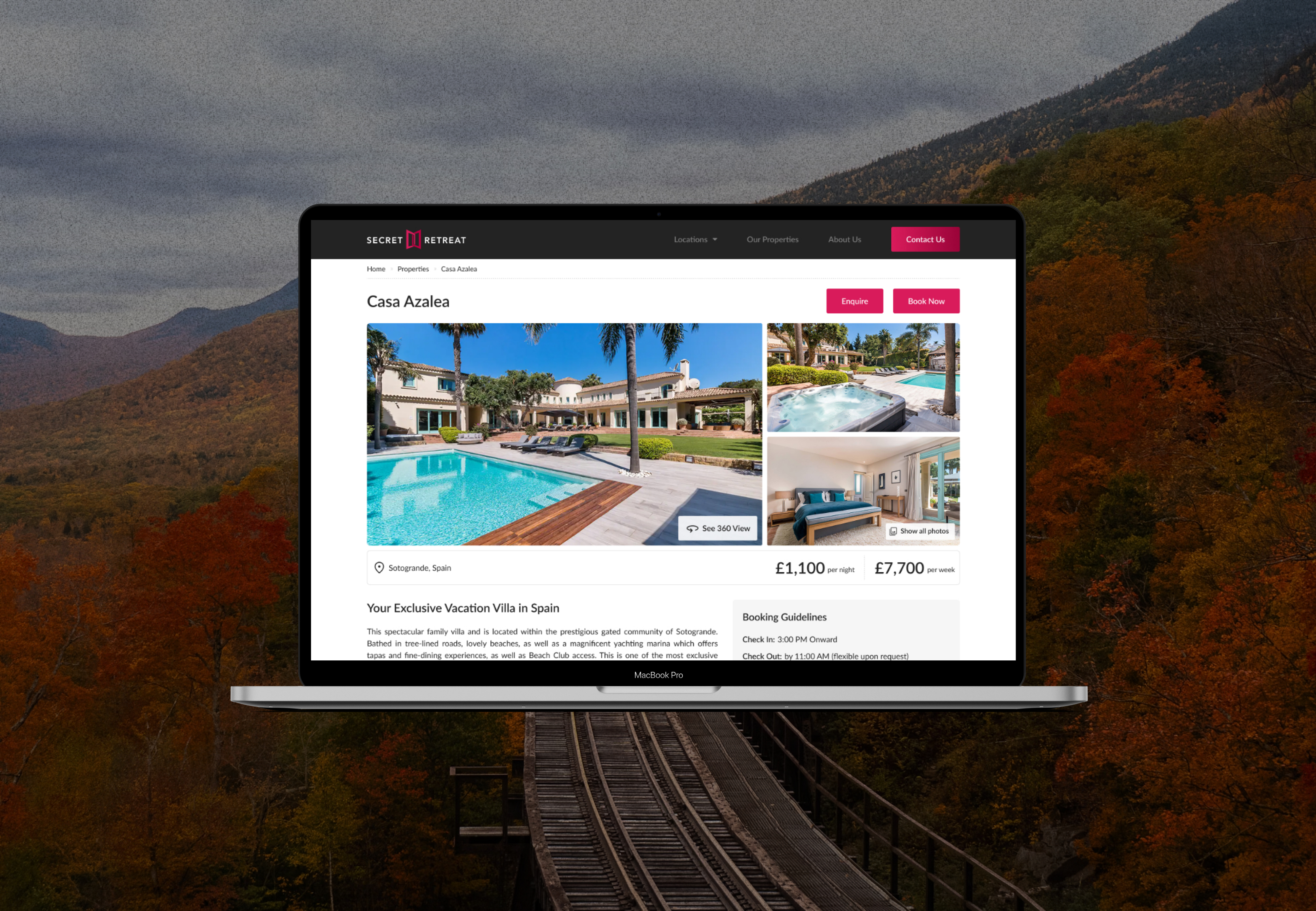
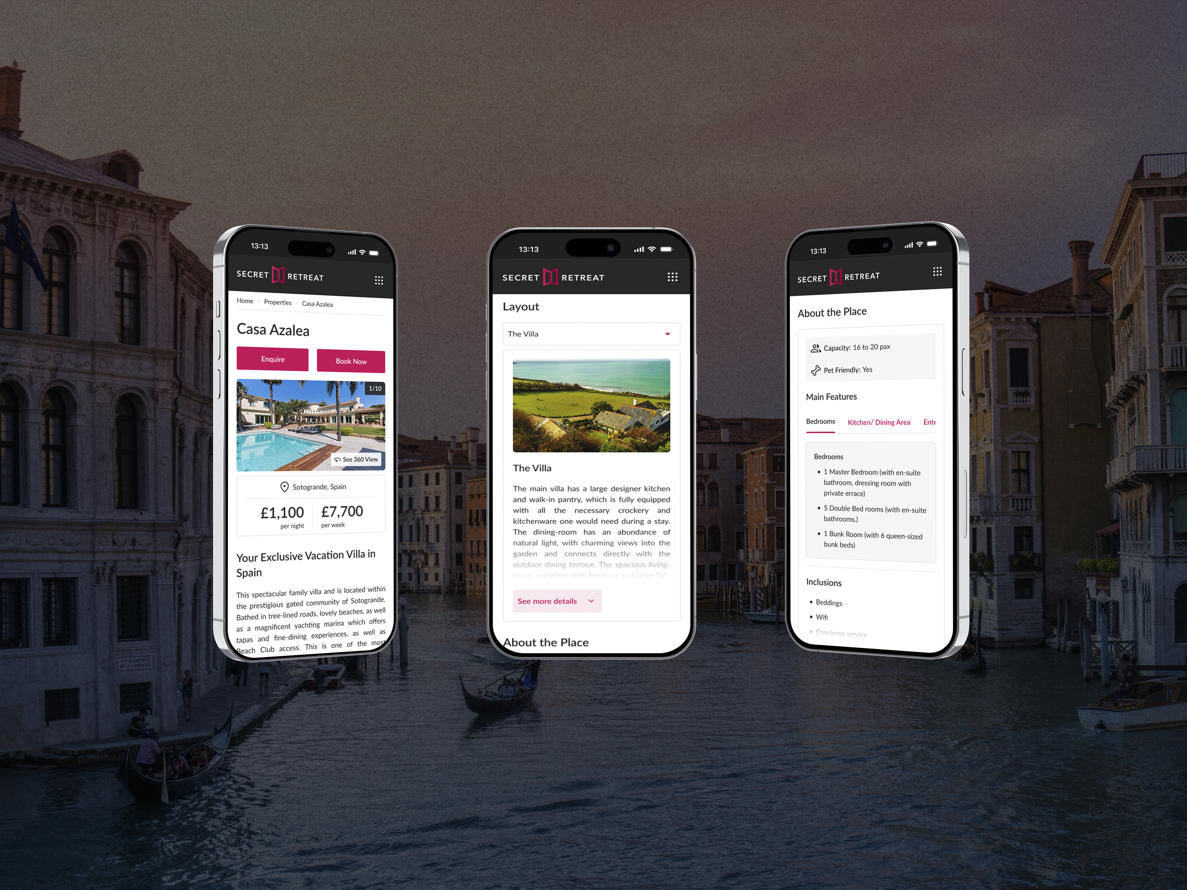
Properties
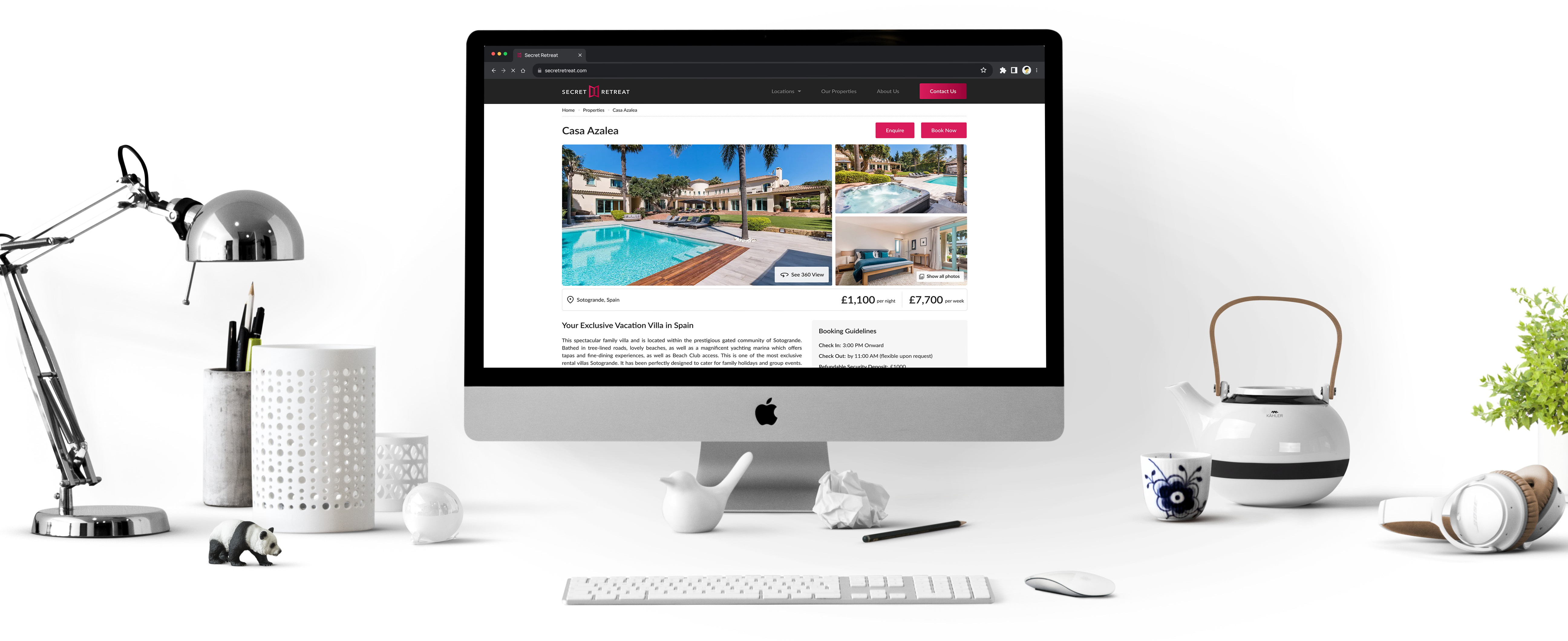
Detail Page
The previous detail page relied heavily on tabbed sections, which hid important property information and disrupted the user’s flow. In the redesign, we prioritized key, decision-making content by placing it upfront, while less critical or lengthy details were organized into tabs for cleaner navigation. We also analyzed content across multiple properties to identify patterns and consolidate similar elements into reusable components for consistency and efficiency.
Final Thoughts
Redesigning Secret Retreats was an opportunity to bridge luxury travel with thoughtful, user-centered design. By simplifying navigation, highlighting curated experiences, and creating a more visually cohesive interface, the new design not only enhances usability but also better reflects the brand’s unique identity. This project reinforced the power of minimalism, clarity, and emotional storytelling in shaping digital experiences
Crafted with love, powered by coffee and the occasional Negroni ☕